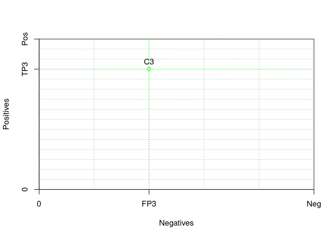
2.2 Coverage Right

A coverage plot depicting the two contingency tables in Table 2.2. The plot is square because the class distribution is uniform (right). Coverage plot for Example 2.1, with a class ratio clr=3.

R figure

Code
h <- 750 
w <- 250 
grid.step <- 50

TP3 <- 600
FP3 <- 100


plot( c(0,w), c(0,h), 
     xaxs = "i",yaxs = "i",
     xaxt = 'n', yaxt = 'n',
     type = "n",
     xlab = "Negatives", ylab = "Positives")

axis(2,c(0,TP3,h),labels=c('0','TP3','Pos'))
axis(1,c(0,FP3,w),labels=c('0','FP3','Neg'))

gx <- grid.step
while (gx <= w) {
  abline(v = gx, col="gray", lty="dotted")
  gx <- gx + grid.step
}
gy <- grid.step
while (gy <= h) {
  abline(h = gy, col="gray", lty="dotted")
  gy <- gy + grid.step
}

col3 <- "green"
points( FP3, TP3, col=col3, type="o")
text( FP3, TP3, "C3", pos=3)
abline(h=TP3, v=FP3, col=col3, lty="dotted")

Python figure

Code
import matplotlib.pyplot as plt

h = 750
w = 250
grid_step = 50

TP3 = 600
FP3 = 100

fig, ax = plt.subplots()
ax.set_xlim(0, w)
(0.0, 250.0)
Code
ax.set_ylim(0, h)
(0.0, 750.0)
Code
ax.set_xlabel("Negatives")
ax.set_ylabel("Positives")

ax.set_xticks([0, FP3, w])
ax.set_xticklabels([0, "FP3", "Neg"])
ax.set_yticks([0, TP3, h])
ax.set_yticklabels([0, "TP3", "Pos"])

gx = grid_step
while gx <= w:
    ax.axvline(x=gx, color='gray', linestyle='dotted')
    gx += grid_step

gy = grid_step
while gy <= h:
    ax.axhline(y=gy, color='gray', linestyle='dotted')
    gy += grid_step

col3 = "green"
ax.plot(FP3, TP3, marker='o', color=col3)
ax.text(FP3, TP3, "C3", verticalalignment='bottom', horizontalalignment='center')
ax.axhline(y=TP3, color=col3, linestyle='dotted')
ax.axvline(x=FP3, color=col3, linestyle='dotted')

plt.show()