2.13 Convexhull right

R figure

Code
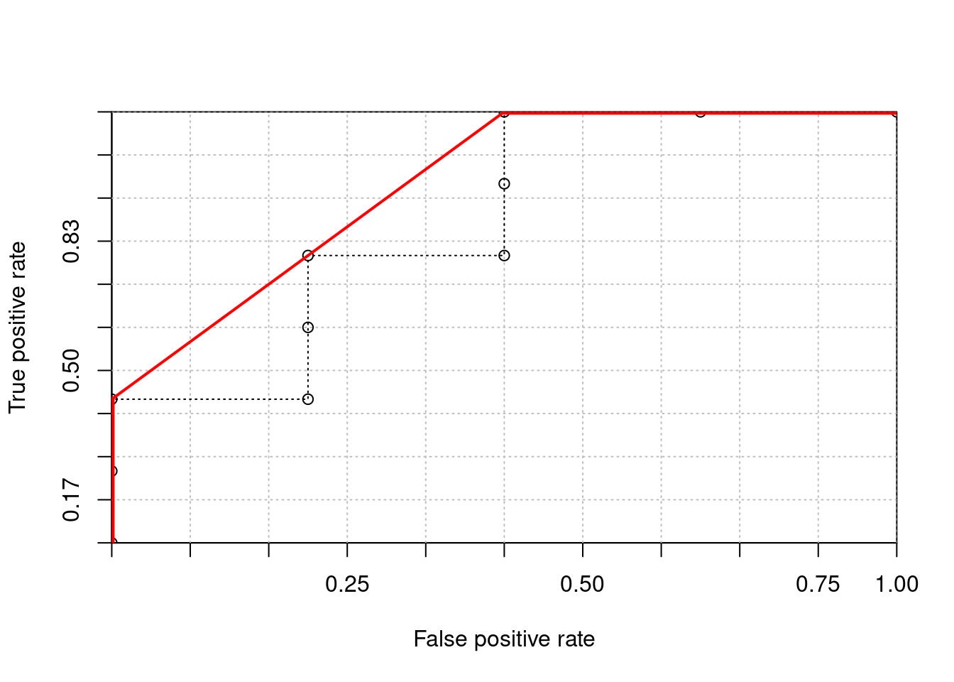
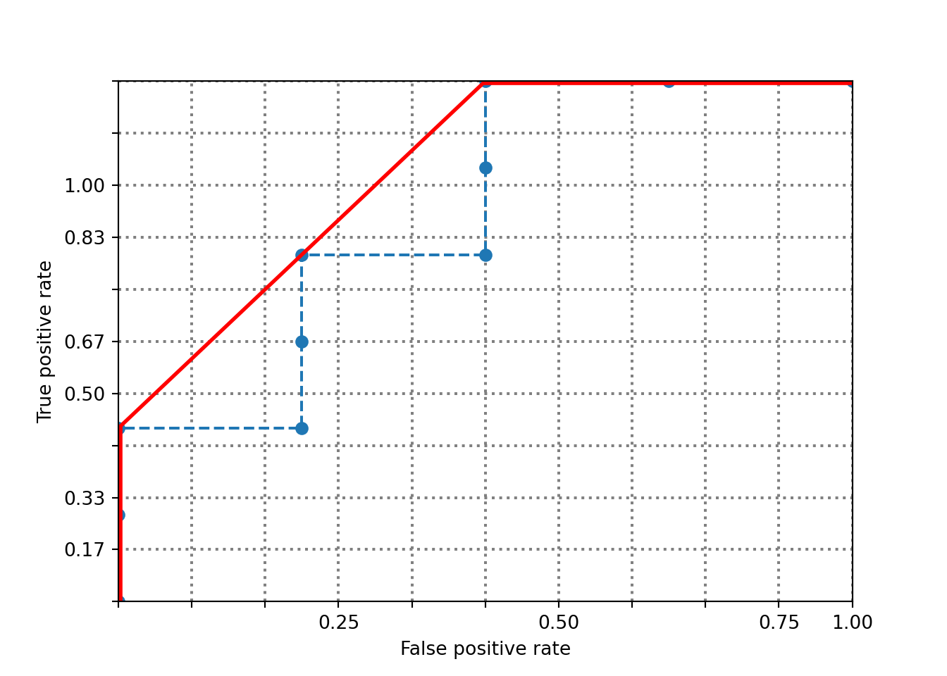
ranking <- c(1, 1, 1, 0, 1, 0, 0, 1, 0, 0)
x <- c(0, 0, 0, 300, 300, 300, 600, 600, 600, 900, 1200)
y <- c(0, 200, 400, 400, 600, 800, 800, 1000, 1200, 1200, 1200)

h <- 1200 
w <- 1200 
grid.step <- 120 

plot(
  c(0, w), c(0, h),
  xaxs = "i", yaxs = "i", 
  xaxt = 'n', yaxt = 'n', 
  type = "n",             
  xlab = "False positive rate",
  ylab = "True positive rate"
)

axis(1, at = seq(0, w, length.out = length(x)), 
     labels = c('', '', '', '0.25', '', '', '0.50', '', '', '0.75', '1.00'))
axis(2, at = seq(0, h, length.out = length(y)), 
     labels = c('', '0.17', '0.33', '', '0.50', '0.67', '', '0.83', '1.00', '', ''))

gx <- grid.step
while (gx <= w) {
  abline(v = gx, col = "gray", lty = "dotted")
  gx <- gx + grid.step
}

gy <- grid.step
while (gy <= h) {
  abline(h = gy, col = "gray", lty = "dotted")
  gy <- gy + grid.step
}

lines(x, y, lty = 3, type = 'o') 

segments(x[1], y[1], x[3], y[3], lty = 1, lwd = 4, col = "red")
segments(x[3], y[3], x[9], y[9], lty = 1, lwd = 2, col = "red")
segments(x[9], y[9], x[11], y[11], lty = 1, lwd = 4, col = "red")

Python figure

Code
import matplotlib.pyplot as plt

ranking = [1, 1, 1, 0, 1, 0, 0, 1, 0, 0]
x = [0, 0, 0, 300, 300, 300, 600, 600, 600, 900, 1200]
y = [0, 200, 400, 400, 600, 800, 800, 1000, 1200, 1200, 1200]

h = 1200
w = 1200
grid_step = 120

fig, ax = plt.subplots()
ax.set_xlim(0, w)
(0.0, 1200.0)
Code
ax.set_ylim(0, h)
(0.0, 1200.0)
Code
ax.set_xticks([0, 120, 240, 360, 480, 600, 720, 840, 960, 1080, 1200])
ax.set_xticklabels(['', '', '', '0.25', '', '', '0.50', '', '', '0.75', '1.00'])

ax.set_yticks([0, 120, 240, 360, 480, 600, 720, 840, 960, 1080, 1200])
ax.set_yticklabels(['', '0.17', '0.33', '', '0.50', '0.67', '', '0.83', '1.00', '', ''])

for gx in range(grid_step, w + 1, grid_step):
    ax.axvline(x=gx, color='gray', linestyle='dotted')
for gy in range(grid_step, h + 1, grid_step):
    ax.axhline(y=gy, color='gray', linestyle='dotted')

ax.plot(x, y, linestyle='dashed', marker='o')

ax.plot([x[0], x[2]], [y[0], y[2]], color='red', linewidth=4)
ax.plot([x[2], x[8]], [y[2], y[8]], color='red', linewidth=2)
ax.plot([x[8], x[10]], [y[8], y[10]], color='red', linewidth=4)

ax.set_xlabel("False positive rate")
ax.set_ylabel("True positive rate")
plt.show()